The creative lead who doesn’t hand the idea off.

Two decades directing creative work: my own studios and forty-four clients, a self-published photography book, commercial video. Then I started designing AI products and shipping them. That combination is the whole pitch: the idea, the craft that renders it, and the build — without a handoff in the middle where the intent gets lost.

Case study 01 · Campaign · Identity · Art direction

Jon Melby Airshows

An air-show pilot in his first two seasons, with no marketing and no budget, against a field of corporate teams. I was the entire department — identity, photography, video, print, booth, collateral and the website.

It placed 2nd and 3rd in consecutive years in the International Council of Air Shows (ICAS) Marketing Competition, the air-show industry's marketing award. The field included the marketing departments of Red Bull, Oracle and the major oil companies — every one of them sponsors a pilot.
I was in the bathroom when the first award was announced.

My role
Concept, identity, art direction, photography, video, print and web — every surface, alone.
Client
Jon Melby / Jon Melby Airshows — my own agency's client, retained for nearly five years, across three aircraft. Still flying today.
Recognition
ICAS Marketing Competition — 2nd and 3rd place, 2002–03.
The decision it turns on

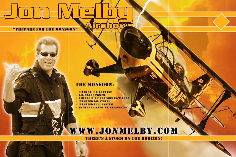
The brand is the plane — and I named it. The name came out of working on the lead photograph. I'd shot Jon's Pitts against a plain blue sky, but it needed more. I pulled a monsoon cloud from my library and began a composite. Putting them together made something neither frame was on its own: the black-and-yellow aircraft breaking out of a storm. The identity was born in that composite, and the name came out of it. I called it The Monsoon — and everything after fell out of the word. The palette was already on the aircraft. The weather was already in the frame. Every surface after that inherited the storm. "There's a storm on the horizon."
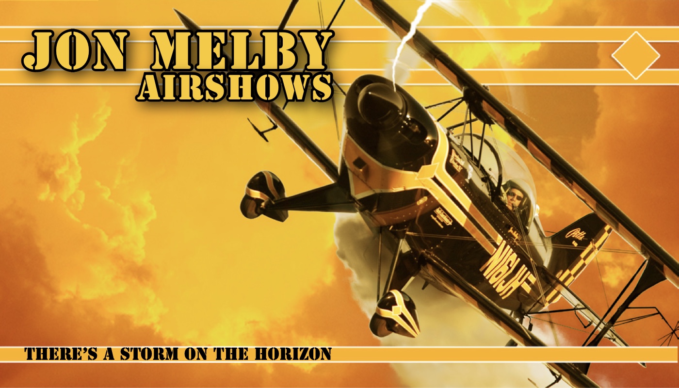
The Jon Melby Airshows identity: a Pitts biplane banking through an orange storm sky, its checkered tail and wheel spats picked up in horizontal bars across the layout, with the wordmark in outlined display type and the line 'There's a storm on the horizon' along the foot.
The identity, taken off the aircraft. The checker on the tail becomes the bar system; the plane's own black-and-yellow becomes the palette; the smoke and cloud become the weather the whole campaign lives in. Re-rendered from the original InDesign artwork.

One person across every surface produces a coherence a committee structurally can't. Red Bull's identity passed through brand guardians, agency partners and sign-off chains. This one passed through me at every touchpoint, so nothing drifted. The shoestring didn't win despite being one person — it won partly because of it.

And it kept working. The awards came in the first two seasons; the relationship ran nearly five years, across three aircraft — a Pitts S1, an S2 and an S1B. Winning something once is a good year. Being kept on for five is the harder credential.

And Melby was one of five. Ed Hamill, Eric Beard, Jim Maroney and Rhett Thompson flew with my work on them too, along with the Copperstate Fly-In. For a stretch I was the marketing shop for the air-show circuit — which is a category, not a client. The Monsoon is the one I show because it is the one that was scored.

Nobody commissioned the storm.

The first campaign isn't the one above. I was starting out, and Jon was art-directing the work himself — which is what most small clients do, and it is the single most common way good work doesn't happen. I was still doing all of it: photography, web, print, graphics, layout, video.
I built what he asked for.

Then a new aircraft arrived and the materials had to be redone.
I delivered exactly what he directed — and then pitched what I would have done instead. That was the Monsoon: name the aircraft, then let the weather that came with the name carry everything. I showed him on a laptop in an Einstein Bagels. He liked it and changed direction. Every award, every surface and every year that followed came out of a pitch nobody asked for.

That's the part worth hiring. Having the better idea is common. Delivering the brief you were given, on time, and then making the case for the one you believe in — without making the client wrong — is how creative direction actually gets earned. You don't win the argument. You make the other option irresistible and let them choose it.
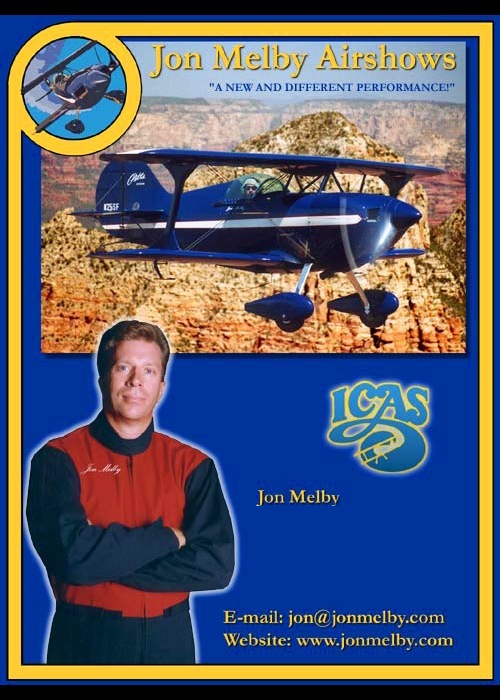
The earlier Jon Melby Airshows advertisement: a blue and white Pitts biplane photographed over red rock canyon, inside a blue and gold bordered frame, with a serif wordmark, the line 'A new and different performance', a cut-out portrait of the pilot in a flight suit, an ICAS logo and a contact block.
The brief, as given. Blue and white, first aircraft, and a headline that describes the act: “A new and different performance.” All of it mine — I shot the plane, built the layout, set the type and signed off the print. The only part that wasn't was the idea. That's the whole reason it's on this page.
The Monsoon-era ICAS magazine advertisement: a black and yellow Pitts biplane with a checkered tail against a gold storm sky, headed 'There's a storm on the horizon', with 'Prepare for the Monsoon' beneath the wordmark, and yellow bars framing the top and foot.
The pitch, once he'd said yes. Second aircraft, and the headline stops describing and starts promising: “There's a storm on the horizon.” One is a description of an act. The other is a concept. The plane was shot from the ground at Jon's aerobatic box south of Chandler — 600mm handheld, fewer than a dozen low passes to work with. Same client, same designer, same year I stopped taking direction and started giving it.
A full-page magazine advertisement: a biplane trailing smoke against a yellow storm sky, headed 'There's a storm on the horizon', with 'Beware the Monsoon' beneath the wordmark and a contact block at the foot.
Third aircraft, same weather. The identity came off the original plane, so a new plane could have ended it — twice. Instead the storm outlived both machines it was taken from, and the line sharpened with it: prepare for became beware. A concept that survives its own source is the test of whether it was one.
Trade show booth signage: the pilot in flight suit at left, the biplane banking across an orange storm sky, an aircraft specification list, and the web address across the foot.
Trade show booth. The same weather at ten feet wide. Booth graphics have to read from across a hall and hold up close.
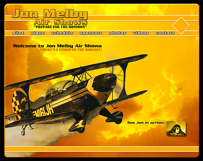
The Jon Melby Airshows website: full-bleed photograph of the biplane against a gold storm sky, a horizontal navigation bar edged with the aircraft's checker, and a welcome line reading 'There's a storm on the horizon'.
jonmelby.com. Full-bleed hero photography and one clear action, in 2002 — when most of the web was still tables and buttons.
The 76-second campaign spot, transcoded from the surviving DivX master — timestamped 28 November 2002, inside the award window. Air-to-air, onboard cockpit POV, word cards hard-cut to the checker, comedy relief, and just enough 2000's Adobe Premiere cheese to make it work. Shown at its original 640×480: it is an artifact with a date, not a showreel, and upscaling 2002 SD to look modern would be the exact judgment failure this page argues against.
The agency years — The Path →

Case study 02 · Brand extension · Art direction · Photography

Visova

A health benefits software platform — claims, enrolment, compliance, routing. Enterprise software for an industry that mostly looks like a spreadsheet. They already had a mark. What they didn't have was a way to look like anything.

I built the expression system around it: one idea, executed across the entire product line. It ran on their site for ten years.

My role
Art direction, conceptual design, photography — my own credit line at the time. The butterfly mark was theirs and I did not draw it. Everything around it is mine.
Client
Visova — health benefits administration software, Scottsdale AZ. The mark is still in service today.
In production
2014 to at least October 2024 — ten years, checked snapshot by snapshot in the Internet Archive rather than remembered.
The decision it turns on

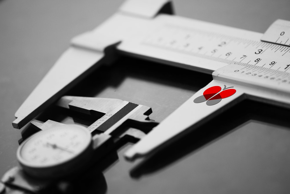
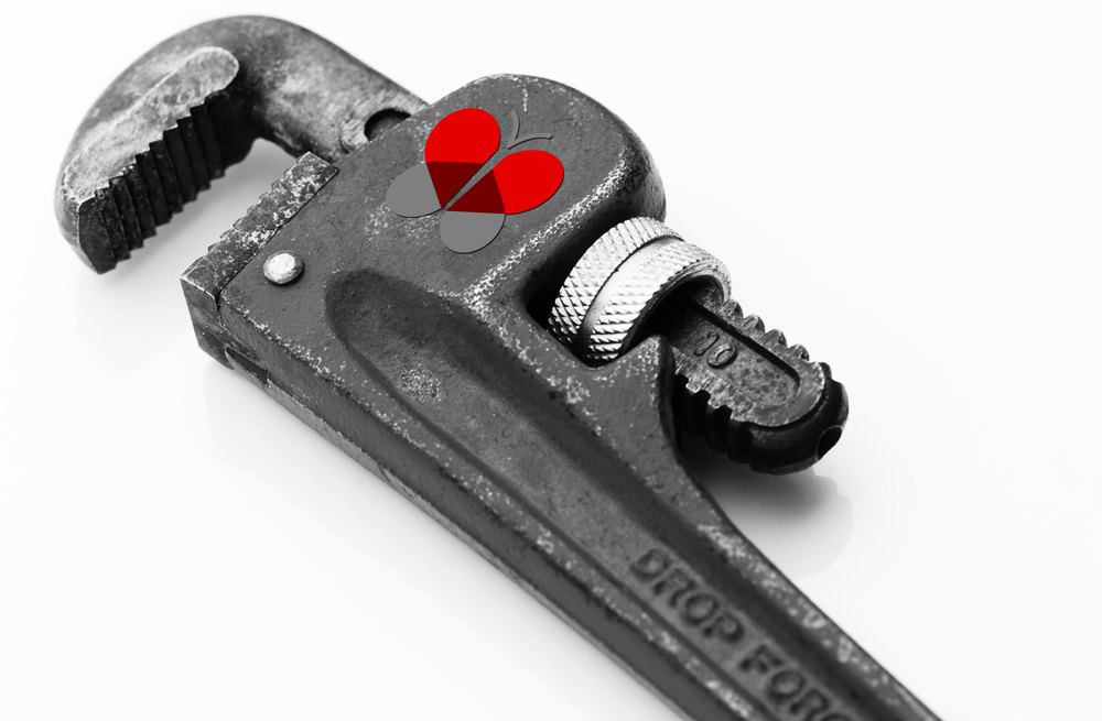
The mark goes inside the instrument — and the instrument names the product. Every frame is the same recipe: a precision tool, shot close, high-contrast black and white, with the client's mark as the only color in the picture. Never laid on top of the shot. Sited where the object's own logic already puts something — the jewel in a watch movement, the membrane in a stethoscope, one key on a keyboard.
Then the tool does a second job. Calipers measure, so the calipers are Testing Tools. A wrench secures, so the wrench is Security and Compliance. Headphones listen, so the headphones are Customer Service. Ten product pages, each with its own instrument. One picture tells you it's Visova, and which part of Visova you're standing in.

A stethoscope lying across a white Mac keyboard, photographed close in high-contrast black and white. The Visova butterfly mark sits inside the stethoscope's diaphragm, where the membrane would be, and its red is the only color anywhere in the frame.
Medicine and computing in one frame. The stethoscope head is the only round thing in the picture, so the mark goes where a membrane goes. Nothing is composited onto the surface — the object was dressed and lit for it, which is why the mark takes the same specular highlight as the chrome around it.
Vernier calipers photographed close in high-contrast black and white, jaws open across a scale, with the red Visova butterfly mark sited on the sliding scale as the only color in the frame.
Calipers measure. The product page is automated regression testing — measuring whether the result matches what was expected.
A heavy drop-forged pipe wrench photographed against white in high-contrast black and white, with the red Visova butterfly mark sited on the flat of the jaw as the only color in the frame.
A wrench tightens. The page is HIPAA security and confidentiality. The heaviest object in the campaign, on the page about holding things shut.
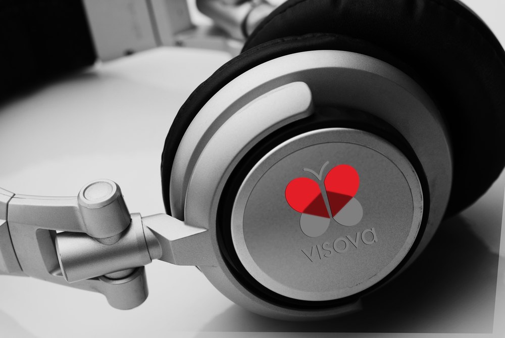
A pair of studio headphones photographed close in high-contrast black and white, ear cup toward the camera, with the red Visova butterfly mark sited in the center of the cup as the only color in the frame.
Headphones listen. The page is call tracking and service dashboards.
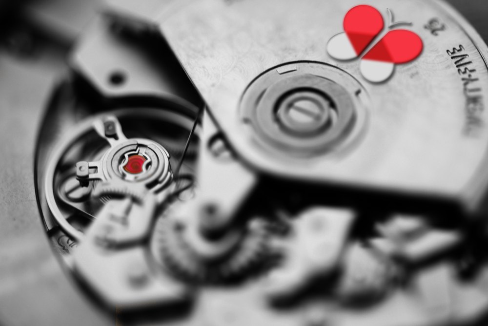
The exposed movement of a mechanical watch photographed in extreme close-up in high-contrast black and white, with the red Visova butterfly mark on the bridge plate and a single red jewel glowing in the gear train — the only two points of color in the frame.
A movement routes. Escapement, gear train, one jewel. The mark's red is picked up by a real jewel in the mechanism — the only frame in the set with two points of color, and the object supplied the second.
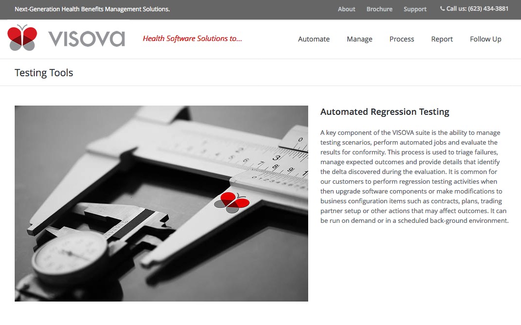
A 2019 archived screenshot of the Visova website's Testing Tools page, showing the site header and navigation, the page title, the calipers photograph at left and a column of body copy about automated regression testing at right.
The same calipers, live on the client's site five years later. Recovered from the Internet Archive — the site has since been rebuilt and the campaign is gone from it. Shown at the size it was captured: it's a record that it shipped and kept shipping, not a portfolio render. That distinction is the entire value of this frame.
The agency years — The Path →

Craft · Aerial cinematography · Creative direction

Two minutes, twenty feet up

Drone footage from Utah, Wyoming and Montana, flown and directed for Lenticulus. Flying that low is harder than flying high, and it is the reason the rock reads with any scale at all. No client and no brief: it is here because the same person chose the light, put the aircraft in it, and decided what the sequence was about.

Drone Reel. Two minutes cut from flights across three states. Aerial photography and creative direction: Christopher Ward. Edit: Lenticulus. Directing someone else's cut of your own footage is not a footnote on a creative-director portfolio — it is the job.

Case study 03 · Concept · Art direction · AI direction

Homestead

A browser-based suite for designing and running a home renovation — floor plans, site and landscape, and a live cost center — tying design → cost → permits in one place. I built it to run the renovation on my own 1962 Phoenix ranch.

It has to be two products at once: a fluid design tool for exploring, and a precise deliverable a contractor or a permit office will accept. Those want opposite things. A generic build blurs them into one mediocre middle. Keeping them cleanly apart was the whole design problem.

My role
Concept, product design, UX, the entire design language, and AI direction — end to end.
Built with
Claude, under an operating contract I wrote: eight named review lenses and a standing audit protocol.
Status
In use on my actual renovation, modeled to a verified tape measurement.
The decision it turns on

One product, two design languages. White print is the deliverable — Georgia headlines, a terracotta accent system, callouts that carry the argument. The tool is the other context: a dark interface, #080c10 with a single blue accent, wrapped around a light drawing surface — the chrome recedes so nothing competes with the plan. Serving both audiences means designing two deliberate contexts, not one stretched compromise. The deliverable is a separate render pass, never a screenshot of the tool.

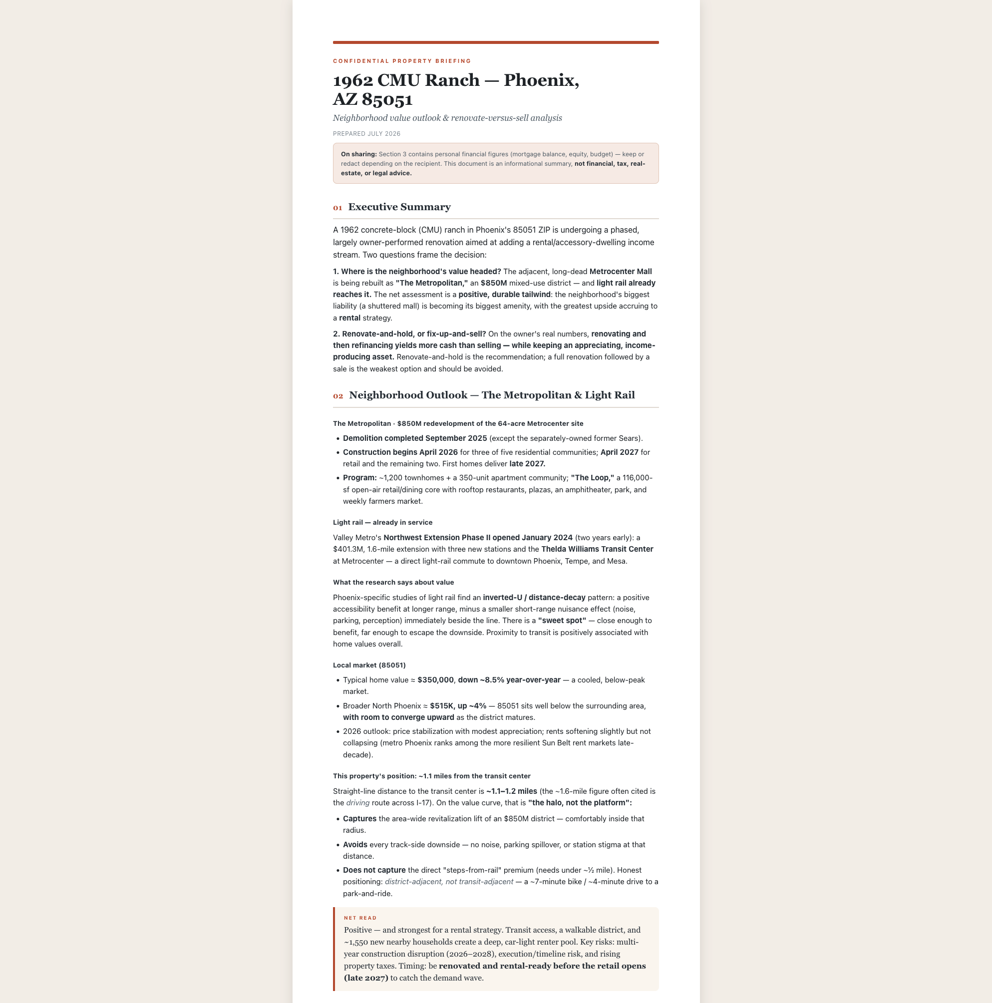
A print-formatted Property Briefing: a serif headline over a terracotta rule, an executive summary, a neighborhood outlook section with market figures, and a highlighted net-read callout.
The Property Briefing — the print deliverable. Serif headlines, a real accent system, cream and slate neutrals, and the recommendation carried in a callout rather than buried in a paragraph. This is the strongest evidence in the set that the output was designed, not generated.
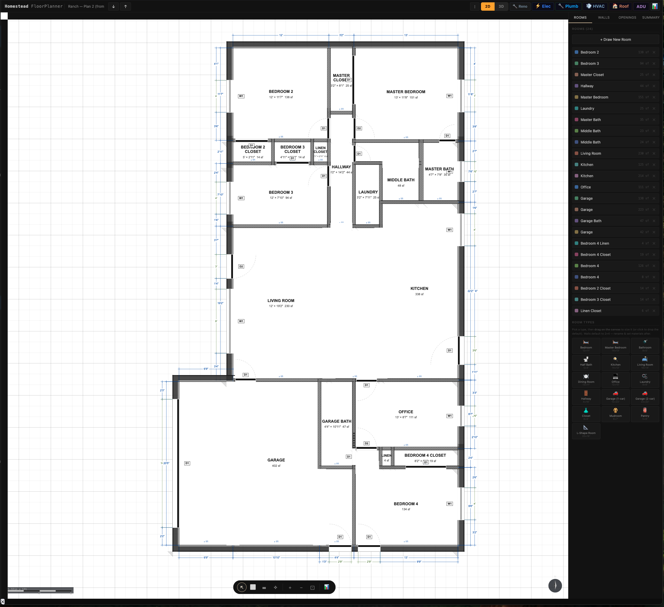
2D floor plan of a 1962 ranch house drawn on a white surface inside the dark tool interface, showing dimension strings, layered wall assemblies, door swings and window symbols, with a room schedule panel at the right.
The same product, the other language. Walls render as real assemblies rather than single lines; openings cut the wall they sit in; dimensions measure to the outer face. Quiet, dense, and built for the person deciding — not the person receiving.

Put those two side by side and the argument needs no caption. Same data, two audiences, and neither one is a compromise toward the other.

See the full evidence pack →

The range, and what it was for

A résumé this wide usually means somebody who couldn't settle.

A boutique ad agency, where the layer I loved was always conceptual direction — the idea that drives the execution. Portraiture, weddings, editorial and commercial photography, long enough to self-publish a coffee-table book: the photography, the marketing, the print production and the writing, all mine. That eye moved into video, and a Part 107 with it. Half a dozen businesses built and run along the way.

None of that is here to say look how many things I can do. Breadth on its own is a warning sign and I'd read it that way too. It earns its place here for one reason: every one of those disciplines is the same question asked in a different medium — is this any good, and how do you know?

Twenty years of asking it. That's the faculty AI hasn't touched. It will hand you a thousand options and hold no opinion about which one is right, and the person who can answer that is doing the only part of the work that didn't just get cheap.

Twenty years, narrated — The Path →

Case study 04 · Product design · The spear

MoneyLedger

A private, offline personal-finance ledger in a single HTML file — no cloud, no account, no network. I run my own money on it. It's here because taste without shipping ability is a mood board.

My role
Concept, product design, UX, functionality, branding, AI direction.
Status
Daily use on real finances since July 2026 — 1,595 transactions.
The decision it turns on

Never write after a failed read. Bad state triggers snapshot recovery, or the app refuses all writes rather than overwrite a corrupt record. For a finance app, silent data loss is unforgivable — so the persistence layer is designed around protecting the record, not around the happy path. Decide what the product can never do to the user, then build backward.

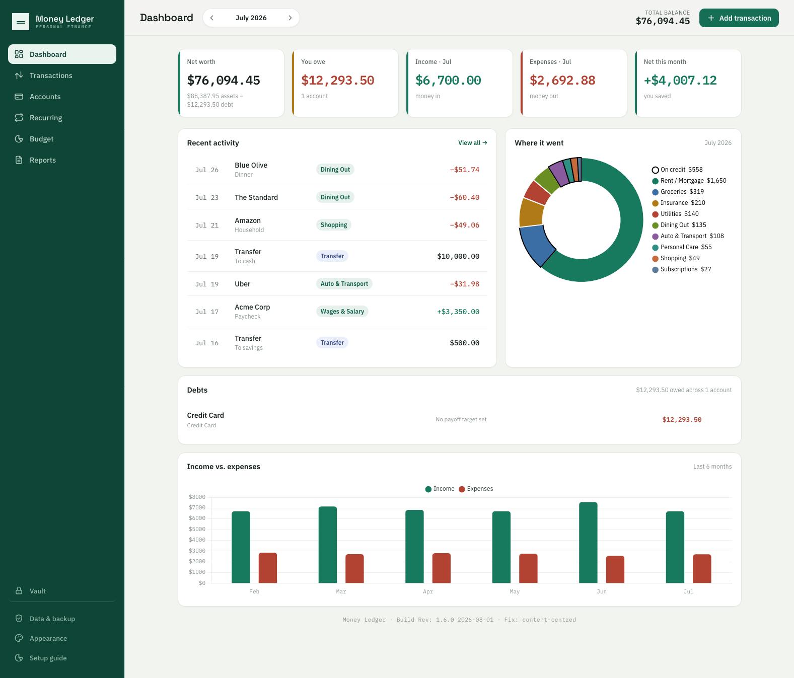
MoneyLedger dashboard: five KPI cards for net worth, debt, income, expenses and net for the month, a recent-activity list, a spending donut broken out by category with each slice's amount in the legend, a debts panel and a six-month income-versus-expenses chart.
Eleven themes, full palettes at verified parity. A finance app doesn't have to feel like a tax form. Making it something you'd want to open is a retention decision, not decoration — and it's the same eye, pointed at a spreadsheet's job.
The product-side case study →

Why this matters more than the screenshots

I screenshot my own work and it turns into a review pass.

Assembling the evidence on this page should have been a screenshot session. Both times it became an audit, because I read the output and didn't believe it.

Defects found
8
across two capture sessions
Found by a person
7
of the 8 — a linter caught the other
Largest single error
402 SF
garage billed as living space
Severity
1 critical
silent record deletion

A permit document counting a garage as conditioned living space. Every expense in a ledger signed + — money leaving, marked as money arriving. A debt goal reading “$12,293.50 of $1,500.00 — 0%”: two true numbers arranged into arithmetic that can't be right.

Not one of those could fail a test, because not one of them was a calculation. A test cannot know that “conditioned space” excludes a garage, or that a plus sign on a debit is a lie. That takes somebody who knows the domain, reads the result, and refuses it.

The fear nobody says out loud about AI creative is slop — infinite volume with nobody judging it. Judging it is the job I've been paid for since 2019.

See the working method →

The part that happened at work

Five tools nobody asked for.

Everything above this line I built at my own desk. These I built inside Intel's validation labs, on the clock, for people who are still using them. Same instinct, seven years, and a job title that says technician.

Tools shipped
5
since 2019 — none of them assigned
USB devices reclaimed
250+
in twenty minutes, one pass
Per system bringup
20–30 min
recurring, every machine
Oldest still running
5 yrs
the 2021 parts database
The decision they all turn on

Stop before you do something irreversible. The drive cleaner finds what it found, shows you, and asks before it wipes. The bringup script asks separately about kernels, because a test system pinned to a specific build is destroyed by the update any sane default would have run. Neither is a technical nicety — both are somebody deciding what this tool must never do to the person using it, then building backward from that. It's the same call I made years later when a finance app of mine turned out to delete records silently.

In 2021 the lab held over a thousand pieces of pre-production silicon across several labs and no way to find any of it — locating one part meant a thirty-minute hand search. I was tired of losing the half hour, so I designed the coding scheme and built the database. It's still what the lab uses.

The four since are the same move. A script that reclaims USB drives which Linux installs have left unreadable — the reason it matters isn't the drives, it's that engineers were interrupting their own work, and each other's, hunting for one that worked. A bringup script that takes a fresh machine from unusable to working, since a new system can't update at all until the corporate proxy configuration is in place and that was being typed by hand every time. A Windows utility that discovers the active COM ports and maps them for serial capture, because the machine already knows which ports are live and making a person retype that is the actual defect. And a PowerShell tool that updates KVM and PDU firmware across the lab and logs what it did, so somebody can audit it afterwards.

I wrote these; AI compressed the work. That's a different claim from the products above, where I set the principles and directed the build against them — and the difference is worth stating rather than blurring. What AI changed here was how fast a noticed problem becomes a shipped fix. It didn't do the noticing.

It's also on the other side of the job, and that side is the one worth hiring. I use AI to troubleshoot systems, and it's wrong often — which isn't a complaint. A wrong answer isn't a failure of the tool; it's a hypothesis. Root cause analysis is the business of killing hypotheses until one survives, and AI generates them faster than I can. That's exactly what I want from it.

A remote desktop service stopped working after a routine point release. The model kept returning to the same fix — switch off the security layer — because that is the answer the internet has for those symptoms. It was wrong, and it was wrong in a way worth understanding: the fault was newer than anything the model had read, so it reached for the most common answer rather than the right one. A model with nothing to draw on doesn't say “I don't know.” It says the most common thing. Knowing that's how it fails is worth more than catching any single wrong answer — and you don't disable a security control to make a service start.

The system behind all of it

The other half of this is a process, and it is written down.

Everything on this page that involved AI — the products, the interfaces, the copy under pressure — came out of 447 hours across 303 sessions, and at that volume the thing that breaks isn't the model. It's drift. So the way I work became a product of its own: a written operating contract, ten workflows that open and close every session the same way, and 91 automated guards that test the method rather than the output. Two have gone red and were closed the same day, and the page keeps the count visible.

Creative direction and validation turn out to be the same muscle — deciding whether work that looks fine actually is. That is the argument in full on its own page.

How the work actually gets made →

The combination is the moat

Two careers that turned out to be one.

I'm a creative director with a product designer's hands. Two decades of concept work — a boutique ad agency, a self-published photography book, commercial video, half a dozen businesses I built and ran — taught me to know good when I see it. Since 2019 I've also been at Intel, validating silicon and server hardware: paid to decide whether something is good enough before a customer ever sees it.

Those felt like two careers until I noticed I keep doing the same thing in both — the lab tools above, a finance app I now run my own money on, a renovation suite for my own house. See the missing tool, build the missing tool. AI made that faster. It didn't change the other half of the job, which is refusing an answer that looks fine and isn't.

Twenty years, narrated — The Path →

Hiring for product instead?

Same work, different order — that door opens on the product decisions. Otherwise: I'm looking for a remote role directing AI creative or AI product work, somewhere the taste and the rigour both get used.

Get in touch Product design door →