I design AI products — and refusing the output is half the job.

Two decades directing creative work. Seven years inside Intel's labs deciding whether hardware was good enough to ship. Both halves point at the same job now: design the product, direct the AI that builds it, and refuse the answer that looks fine and isn't.

Case study 01 · Product design · Concept · AI direction

MoneyLedger

A private, offline personal-finance ledger that lives in a single HTML file — open it in a browser and it just runs. No cloud, no account, no network. I run my own money on it.

Personal finance tools force a bad trade: convenient but cloud-hosted, or private but a clunky spreadsheet. I wanted the third thing nobody makes — private, offline, own-your-data, and actually designed.

My role
Concept, product design, UX, functionality, branding, AI direction — the whole thing.
Built with
Claude — authored, not just used. I set the product's principles and directed the build against them.
Status
In daily use on my real finances since July 2026 — 1,595 transactions.
The decision it turns on

Never write after a failed read. Bad state triggers snapshot recovery, or the app refuses all writes to preserve the corrupt record rather than overwrite it. For a finance app, silent data loss is unforgivable — so I designed the persistence layer around protecting the record, not around the happy path. That's a product-judgment call, not a code trick: decide what the product can never do to the user, then build backward from it.
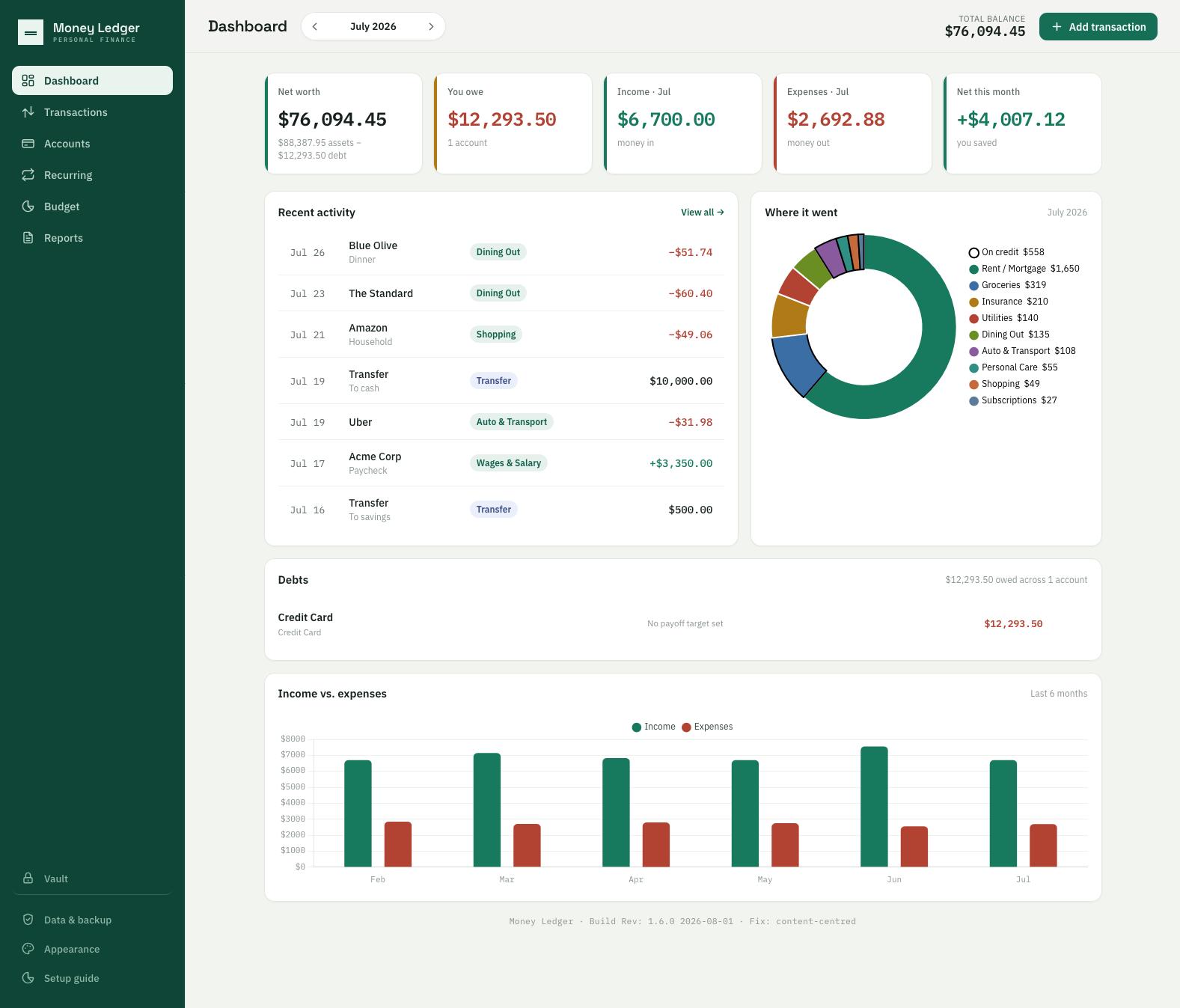
MoneyLedger dashboard: five KPI cards for net worth, debt, income, expenses and net for the month, a recent-activity list, a spending donut broken out by category with each slice's amount in the legend, a debts panel and a six-month income-versus-expenses chart.
The dashboard. Eleven themes exist because a tool you open every week shouldn't feel like a tax form — that's a retention decision, not decoration.
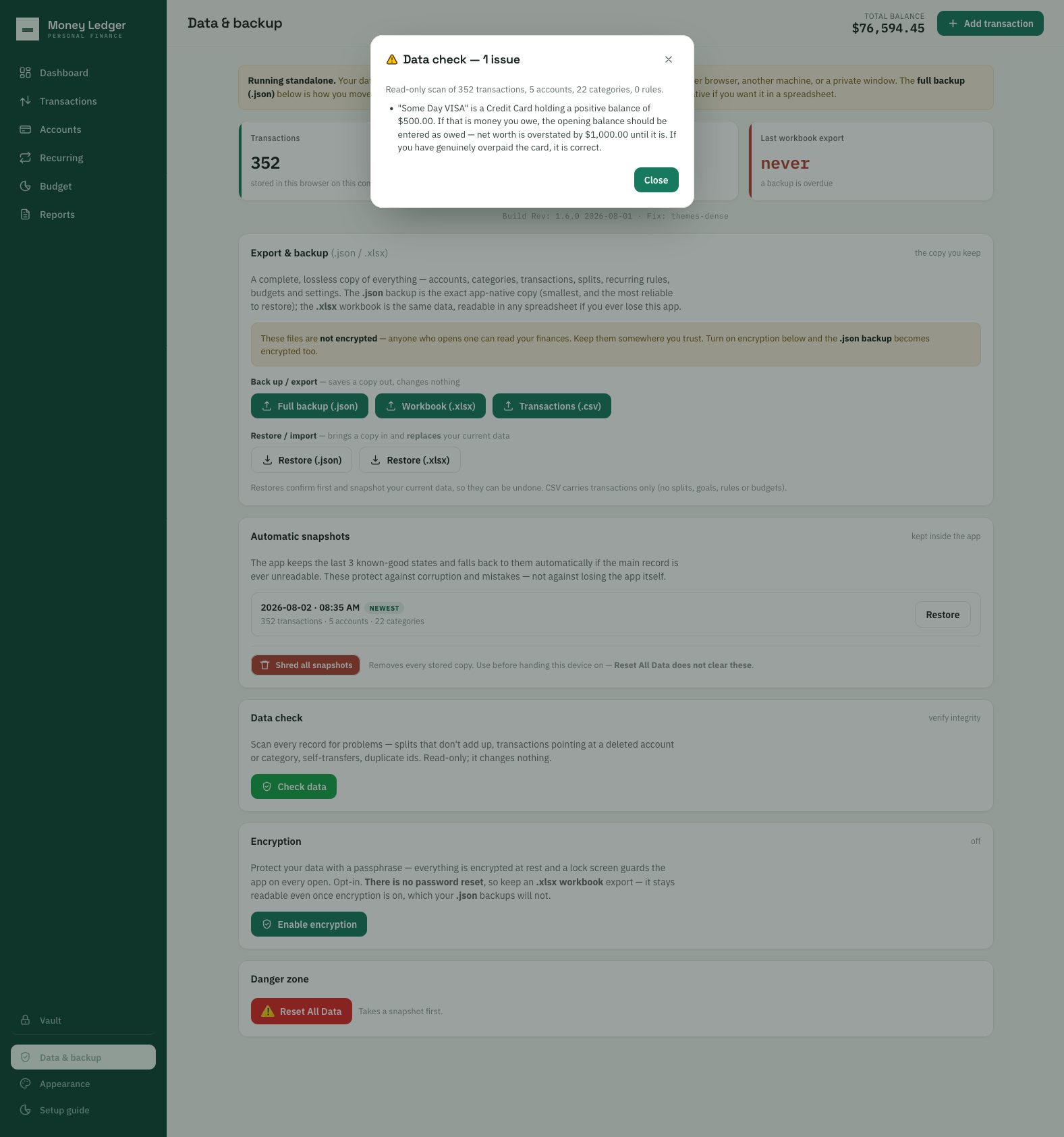
The app's data-check dialog reporting one issue: a credit card holding a positive balance of $500.00, warning that net worth is overstated by $1,000.00 until the opening balance is entered as owed, and noting that if the card was genuinely overpaid the figure is correct.
The integrity check, turned on its author. You just wait a minute, mister. It names the exact overstatement — $1,000.00, twice the balance — and concedes the case where the user is right. A product that states the consequence and admits its own uncertainty is exercising judgment, not running validation.

The app also carries an encrypted password vault — logins with live TOTP codes, cards, secure notes, its own passphrase. The design decision worth naming is section-lock rather than app-lock: the vault is a locked room inside an app you are already using, so checking a balance never asks for a passphrase and reading a password always does. ★ And it is the cleanest evidence here for why a person still has to look. Automated verification proved the cryptography correct and found zero behavioral defects — every bug in that build came from driving a real browser. The maths was right and the product was broken. The bug ledger →

When a self-imposed constraint — no third-party JavaScript, no network — left no room for a spreadsheet library, I had the AI hand-build the Excel engine: a ZIP/CRC32 reader-writer. The constraint forced a cleaner, fully self-contained result. That's the pattern I care about: the limit is the design tool.

See the full evidence pack →
Case study 02 · Design language · Domain UX

Homestead

A browser-based suite for designing and running a home renovation — floor plans, site and landscape, and a live cost center — tying design → cost → permits in one place, location-aware down to the ZIP.

I'm mid-renovation on a 1962 Phoenix ranch. Every tool did one slice: draw a plan, or track a budget, or look up setbacks. The expensive mistakes happen in the gaps between tools — you design something you can't afford, or can't permit, and find out later.

My role
Concept, product design, UX, the whole design language, and AI direction — end to end.
Built with
Claude, under an operating contract I wrote: eight named review lenses and a standing audit protocol.
Status
In use on my actual renovation, modeled to a verified tape measurement.
The decision it turns on

One product, two design languages. The design tool is a dark interface wrapped around a light drawing surface — the chrome recedes so nothing competes with the plan. White print is the deliverable. The person exploring wants a quiet, focused workspace; the person receiving the plan — a contractor, a permit office — wants something authoritative on paper. Serving both means designing two deliberate contexts, not one stretched compromise. The deliverable is a separate render pass, never a screenshot of the tool.

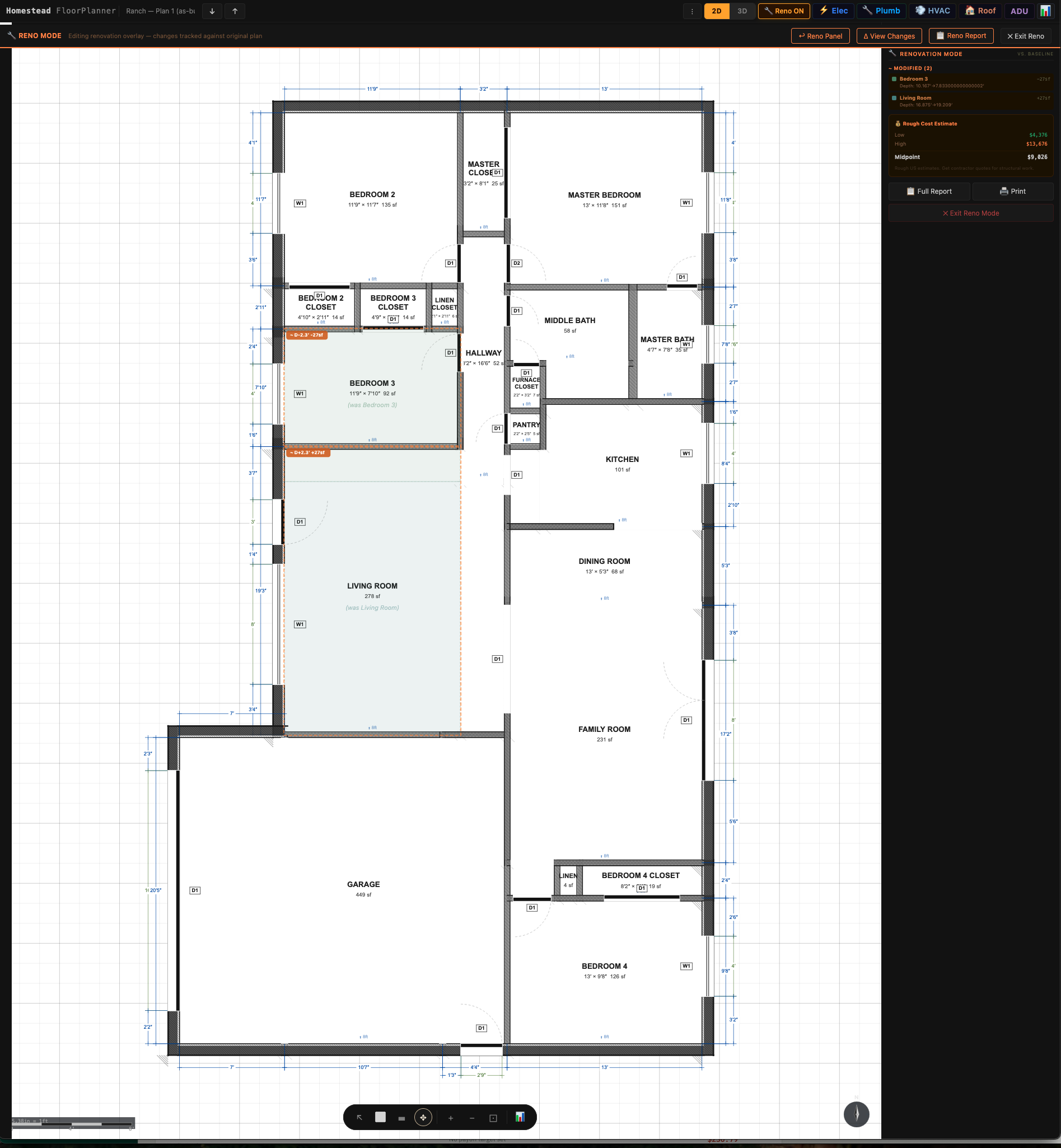
The floor planner in renovation mode: rooms outlined against their original positions with labels reading 'was Bedroom 3' and 'was Living Room', square-footage deltas, and a live cost estimate panel updating alongside.
Reno mode. The value isn't drawing — it's the connection. Move a wall and the money moves with it. Ghost outlines hold the original layout, the “(was Bedroom 3)” labels survive the rename, and the cost panel prices the delta live.
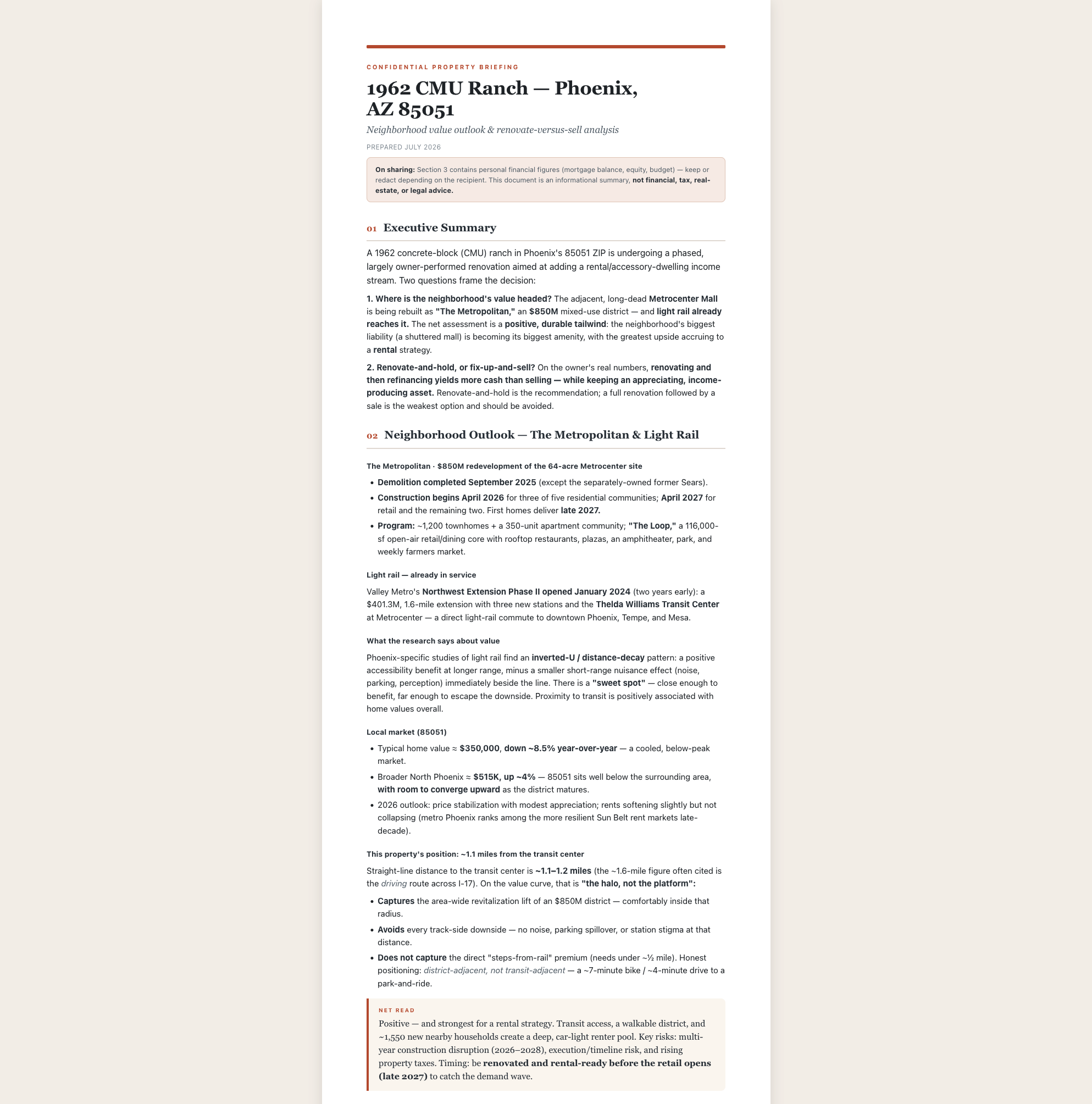
A print-formatted Property Briefing: a serif headline over a terracotta rule, an executive summary, a neighborhood outlook section with market figures, and a highlighted net-read callout.
The same data as a deliverable. Editorial typography, a real accent system, the recommendation carried in a callout rather than buried in a paragraph. Driven by the same project data as the canvas above, and a completely different object.
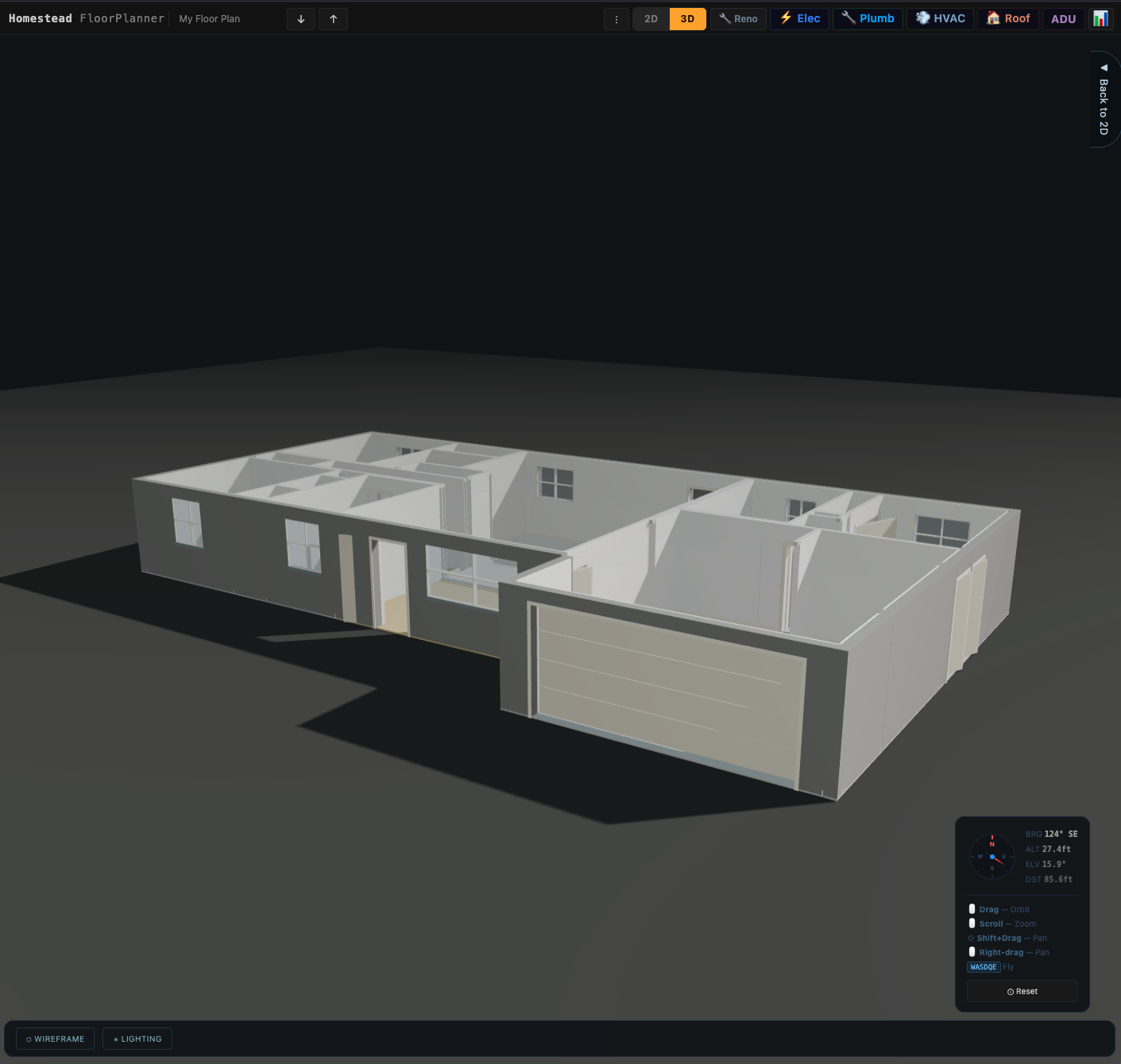
The floor plan in 3D: a single-storey ranch house shown from above and to the side, walls shaded white against a dark ground, windows and doors cut into them, the garage door closed. A camera readout in the corner gives bearing 124 degrees southeast, altitude 27.4 feet, elevation 15.9 degrees, distance 85.6 feet.
The plan, stood up. Same project data as the 2D canvas — not a separate model kept in sync, which is where suites like this usually rot. You fly it. Drag to orbit, scroll to zoom, shift-drag to pan, and WASDQE to walk the camera through the house — the readout in the corner is live bearing, altitude and distance, because at that point you are navigating a building rather than spinning a thumbnail. The toolbar is the honest measure of scope: Reno, Elec, Plumb, HVAC, Roof, ADU. Six disciplines over one house.
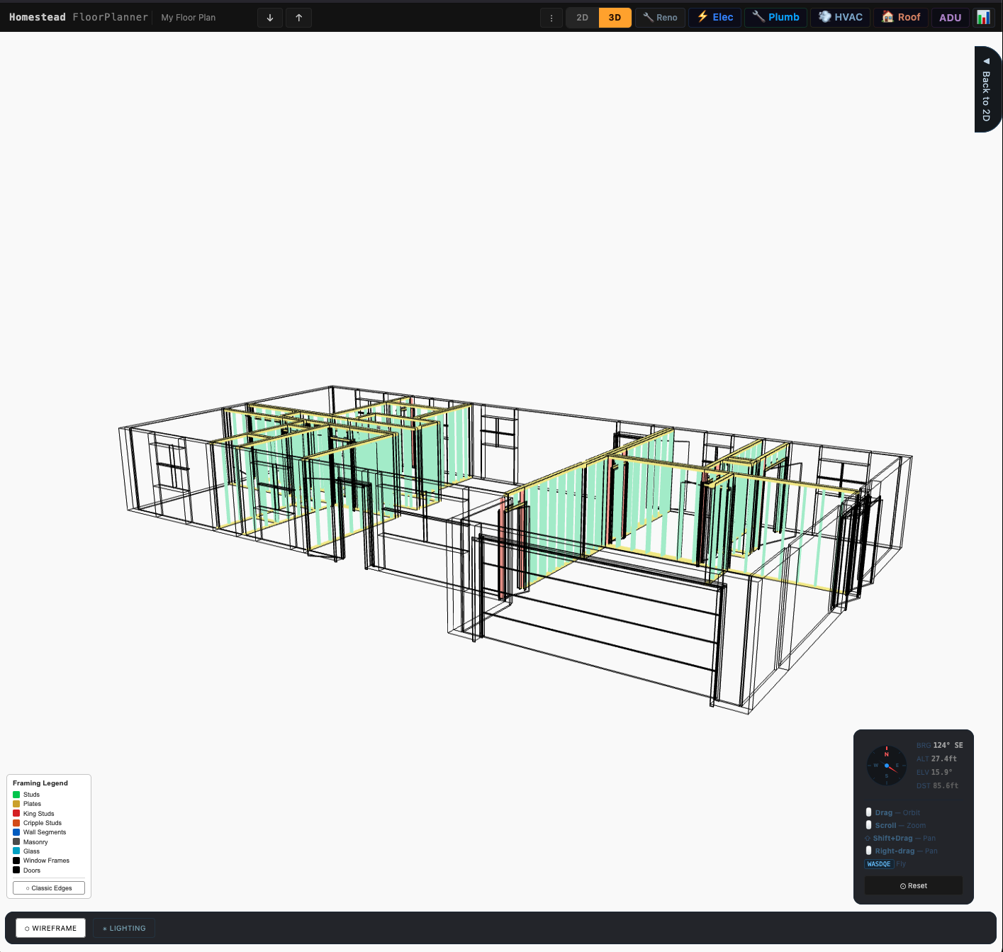
The same house from the identical camera position, switched to framing view: the walls resolve into individual studs and plates drawn in green and yellow, king studs and cripple studs picked out in red around the door and window openings, window frames and doors in black. A legend at lower left names each member type.
And the same house, framed. Identical camera — bearing, altitude and distance all unchanged — so the two read as one object seen twice rather than two pictures. The legend is the claim: studs, plates, king studs and cripple studs, masonry, glass, window frames, doors. King and cripple studs are the members that frame an opening — so the model knows what a door does to a wall, not just where to draw a gap. A floor planner draws a picture of a house. This one is carrying the structure underneath, which is why the room builder can offer you the wall, its mouldings and its openings as separate things to edit.
See the full evidence pack →

Case study 03 · Systems design · Color science · AI direction

Insulator

An offline music player with two interfaces, and the split is by form factor rather than by taste. The classic Winamp form — genuine .wsz skin support — is a fixed 275×116 framebuffer, so it belongs where windows dock: desktop, and iPad. A phone has no windows to dock, so it gets ARC — the modern skin, and my design. You pick a photograph from your library and it becomes the ground the interface sits on. One decision about where the thing is used, not two features. An insulator holds high tension so it never arcs; ARC is the one place that energy is allowed to show. No streaming, no account, no network. It plays the files you already own. See the proof — the phone interface, with live controls →

I built it because of how I actually work. Long hours on composites, mockups and edits with my own music running — and every player wanted an account and a connection first. High tension, low noise: the line carries the music and nothing else gets through.

My role
Concept, product design, naming and the trademark clearance behind it, the color system, AI direction.
Built with
Claude — Rust, nine crates, 257 commits. I wrote the build as twenty-one ordered specs with acceptance criteria, then directed against them.
Status
In build — sixteen of twenty-one specs complete. On the desktop it plays, loads real .wsz skins, and manages a 3,083-track library across five roots with audio-fingerprint duplicate detection; the default skin that ships with it is painted.The iOS build renders my own Winamp Classic skin from the same shared Rust compositor — the architecture argument above, proven rather than asserted. In the simulator: it has not run on physical hardware yet. Remaining: the iOS shell, packaging, a hardening pass.
The decision it turns on

The Winamp UI is a framebuffer, not a widget set. 275×116 pixels of RGBA — no layout engine, no text metrics, hit-testing by rectangle comparison. Once you see that, the whole architecture falls out of it: the interface can live in shared code as pixels, so each platform needs only a window, a bitmap and an audio sink — a few hundred lines. It also means the interface can be tested as an image, which you cannot do to a native widget tree. And it means a photograph can be the interface. One observation, three consequences. That is what looking closely buys you.

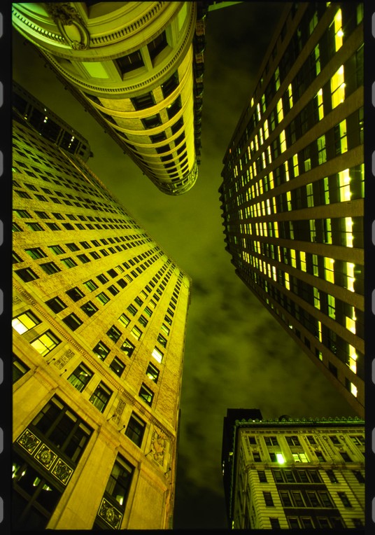
A 35mm film scan looking up between city towers at night in the NYC Financial District, sodium-lit yellow-green against a dark sky, printed with the sprocket holes left in down both edges.
ARC — the other interface, and this one is my design. The classic shell reproduces Winamp; this is the mode where the design is a decision rather than a reproduction. The user picks a photograph from their own library and it becomes the ground the interface sits on — one image behind all three panels, cut out by them, desaturated under the controls so white type stays legible over any picture. That constraint is the whole design problem: the app cannot know what photograph is coming.
One-handed thumb operation, on the hand already holding the phone — for the controls you actually use. Most players assume two thumbs and a desk. ARC assumes one hand and no surface, and the design work is deciding which controls have earned that reach. Winamp stacks player, EQ, playlist; ARC inverts it to playlist, player, EQ, because on a phone the lowest third is the reachable third and browsing belongs up top, where a scroll gesture works from anywhere. ★ Playback and browsing sit in comfortable thumb reach. The equalizer does not need to — an EQ is set once to your listening preference and left there, so it is not a one-handed control, and pretending otherwise would be designing for a demo rather than a commute. It still takes the bottom, because when you do adjust it you are dragging — sustained, precise, over a small vertical range, and nothing compensates for poor reach on a drag.Which is also why it locks. The equalizer occupies the most reachable band on the screen and is disengaged by default: the thing your thumb passes over most often is the thing you least want to move by accident. Unlock it deliberately, and by then you are probably using two hands anyway.And nothing is pinned to the very bottom edge — that band sits outside the comfortable thumb arc and forces a regrip, which is exactly what most apps get wrong.
A 35mm film scan, NYC Financial District at 2am that I shot on the street and printed with the sprocket holes left in. The full design proof is published, with live controls — drag them and the phone re-themes →
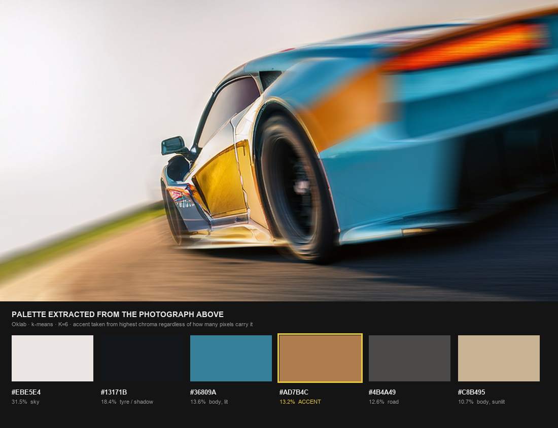
Above, a Gulf-liveried race car in pale blue with an orange flank, generated in Adobe Firefly. Below, the six colors the generator extracted from it, shown as swatches with their hex values and the share of the frame each covers. The orange, at 13.2 percent, is outlined in yellow-green and marked as the accent.
A photograph in, a palette out. The generator clusters the image in Oklab and assigns color roles — and it takes the accent from highest chroma regardless of how many pixels carry it. Run on this frame it picks the orange at 13.2% of the image, over the sky at 31.5% — a cluster 2.4× rarer than the most common one. Anyone who knows this livery thinks “orange” — and so does the rule. That is the difference between a palette and a brand.
My own render, made in Adobe Firefly — the same workflow as the MoneyLedger sidebars. The numbers above are measured from it, not carried over from an earlier example.
Two versions of the same generated player interface, one above the other. The upper version has muddy brownish-orange accents and flat, low-contrast bevels. The lower version has bright saturated orange accents, crisp white numerals and bevels that read clearly.
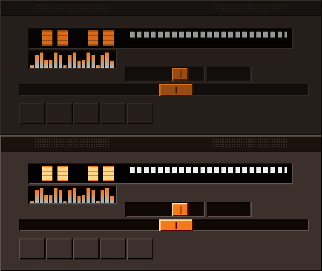
My own spec was wrong, and building it is what proved it. I had written “recolor by role color times luminance”. Top row is what that produces: in sRGB it has no pivot, so every value darkens and the color never reproduces — measured #3B302B arriving as #251E1B, with chroma collapsing from 0.0123 to 0.0055 because multiplying toward black desaturates. Bevel shadows went gray instead of staying in the skin’s hue. Bottom row scales lightness about a pivot in Oklab instead; chroma holds flat at 0.018. Both are published because the wrong one is the evidence.
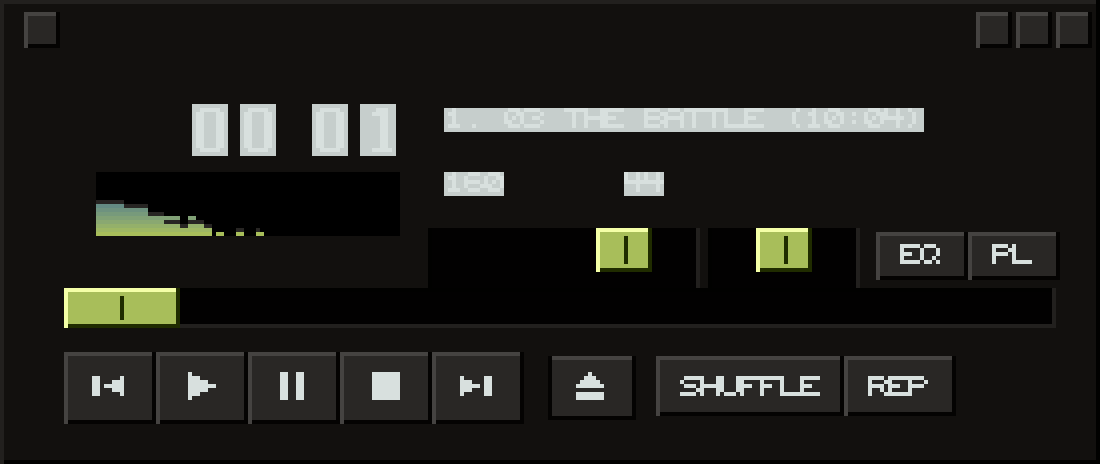
The classic player window rendered in the Insulator palette: a near-black ground, mid-gray transport buttons with visible bevels, yellow-green slider handles, pale gray display type, and a live spectrum analyzer decaying at the left.
The classic shell, in the brand palette — and it cost the brand's own ground color. The identity names cobalt as the ground. Generated that way the window goes flat: every button is cobalt on cobalt and nothing separates. The cause is structural, not a setting — the generator derives roles by luminance, and a mid-lightness saturated ground has no range to derive from. Widening the bevel spread from 0.16 to 0.40 barely moved it.
The classic skin cannot be brand-literal and still read as a skin. This one drops cobalt and uses the near-black instead — which is what the phone interface had already done, before anyone had worked out why it had to. The design reached the right answer before the reasoning caught up.

Why this matters more than the screenshots

I screenshot my own work and it turns into a review pass.

Assembling the evidence on this page should have been a screenshot session. Both times it became an audit, because I read the output and didn't believe it.

Defects found
8
across two capture sessions
Found by a person
7
of the 8 — a linter caught the other
Largest single error
402 SF
garage billed as living space
Severity
1 critical
silent record deletion

A permit document counting a garage as conditioned living space. Every expense in a ledger signed + — money leaving, marked as money arriving. A debt goal reading “$12,293.50 of $1,500.00 — 0%”: two true numbers arranged into arithmetic that can't be right. And the serious one: re-running setup deleted transactions silently, with no confirmation and nothing to restore from, then reported success.

Not one of those could fail a test, because not one of them was a calculation. The code did exactly what it was told. A test cannot know that “conditioned space” excludes a garage, or that a plus sign on a debit is a lie. That takes somebody who knows the domain, reads the result, and refuses it.

AI made producing things nearly free, so the value moved to knowing which output to keep. I've been paid to do that since 2019.

See the working method →

The part that happened at work

Five tools nobody asked for.

Everything above this line I built at my own desk. These I built inside Intel's validation labs, on the clock, for people who are still using them. Same instinct, seven years, and a job title that says technician.

Tools shipped
5
since 2019 — none of them assigned
USB devices reclaimed
250+
in twenty minutes, one pass
Per system bringup
20–30 min
recurring, every machine
Oldest still running
5 yrs
the 2021 parts database
The decision they all turn on

Stop before you do something irreversible. The drive cleaner finds what it found, shows you, and asks before it wipes. The bringup script asks separately about kernels, because a test system pinned to a specific build is destroyed by the update any sane default would have run. Neither is a technical nicety — both are somebody deciding what this tool must never do to the person using it, then building backward from that. It's the same call I made years later when a finance app of mine turned out to delete records silently.

In 2021 the lab held over a thousand pieces of pre-production silicon across several labs and no way to find any of it — locating one part meant a thirty-minute hand search. I was tired of losing the half hour, so I designed the coding scheme and built the database. It's still what the lab uses.

The four since are the same move. A script that reclaims USB drives which Linux installs have left unreadable — the reason it matters isn't the drives, it's that engineers were interrupting their own work, and each other's, hunting for one that worked. A bringup script that takes a fresh machine from unusable to working, since a new system can't update at all until the corporate proxy configuration is in place and that was being typed by hand every time. A Windows utility that discovers the active COM ports and maps them for serial capture, because the machine already knows which ports are live and making a person retype that is the actual defect. And a PowerShell tool that updates KVM and PDU firmware across the lab and logs what it did, so somebody can audit it afterwards.

I wrote these; AI compressed the work. That's a different claim from the products above, where I set the principles and directed the build against them — and the difference is worth stating rather than blurring. What AI changed here was how fast a noticed problem becomes a shipped fix. It didn't do the noticing.

It's also on the other side of the job, and that side is the one worth hiring. I use AI to troubleshoot systems, and it's wrong often — which isn't a complaint. A wrong answer isn't a failure of the tool; it's a hypothesis. Root cause analysis is the business of killing hypotheses until one survives, and AI generates them faster than I can. That's exactly what I want from it.

A remote desktop service stopped working after a routine point release. The model kept returning to the same fix — switch off the security layer — because that is the answer the internet has for those symptoms. It was wrong, and it was wrong in a way worth understanding: the fault was newer than anything the model had read, so it reached for the most common answer rather than the right one. A model with nothing to draw on doesn't say “I don't know.” It says the most common thing. Knowing that's how it fails is worth more than catching any single wrong answer — and you don't disable a security control to make a service start.

The system behind all of it

Every product above was built with AI. The way I direct it is a product I built too.

447 hours across 303 sessions, and at that volume the thing that breaks isn't the model being wrong — you catch that. It's drift. So the process got written down: an operating contract, ten workflows that open and close every session the same way, and 91 automated guards that test the method rather than the output. Two of them have gone red and were closed the same day — and the page keeps the count visible rather than quietly turning green.

A dashboard that only ever shows green has stopped being an instrument.

How the work actually gets made →

The combination is the moat

Two careers that turned out to be one.

I'm a creative director with a product designer's hands. Two decades of concept work — a boutique ad agency, a self-published photography book, commercial video, half a dozen businesses I built and ran — taught me to know good when I see it. Since 2019 I've also been at Intel, validating silicon and server hardware: paid to decide whether something is good enough before a customer ever sees it.

Those felt like two careers until I noticed I keep doing the same thing in both — the lab tools above, a finance app I now run my own money on, a renovation suite for my own house. See the missing tool, build the missing tool. AI made that faster. It didn't change the other half of the job, which is refusing an answer that looks fine and isn't.

Twenty years, narrated — The Path →

Hiring for creative direction instead?

Same work, different order — that door opens on the craft. Otherwise: I'm looking for a remote role directing AI product or AI creative work, somewhere the taste and the rigour both get used.

Get in touch Creative director door →